HTML
We first prepare a clock region #clock on the page, and put the figures you want to show on .digits.
<div id="clock" class="light">
    <div class="display">
        <div class="digits">
            ...digits
        </div>
    </div>
</div>
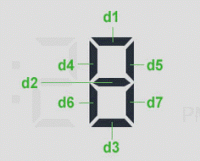
We are ready to show the digital clock format HH: mm: ss, which consists of eight minutes and seconds and two digital delimiter ":" composed figure is composed by seven short bars, such as the number 8 which consists of seven short bars form, we use .d1 ~ .d7 seven in the span element in html to determine the effect of different digital display through the CSS. The following code is added to the .digits, use the value of the class represented 0-9 style from zero to nine, using .dot said interval symbols.

<div class="eight">
    <span class="d1"></span>
    <span class="d2"></span>
    <span class="d3"></span>
    <span class="d4"></span>
    <span class="d5"></span>
    <span class="d6"></span>
    <span class="d7"></span>
</div>
CSS3
We set each digit span of transparency is 0, that is not visible by default, by the CSS3: before and: after setting features to make the bars represent numbers of corner effects.
#clock .digits div{
    text-align:left;
    position:relative;
    width: 28px;
    height:50px;
    display:inline-block;
    margin:0 4px;
}

#clock .digits div span{
    opacity:0;
    position:absolute;

    -webkit-transition:0.25s;
    -moz-transition:0.25s;
    transition:0.25s;
}

#clock .digits div span:before,
#clock .digits div span:after{
    content:'';
    position:absolute;
    width:0;
    height:0;
    border:5px solid transparent;
}

#clock .digits .d1{            height:5px;width:16px;top:0;left:6px;}
#clock .digits .d1:before{    border-width:0 5px 5px 0;border-right-color:inherit;left:-5px;}
#clock .digits .d1:after{    border-width:0 0 5px 5px;border-left-color:inherit;right:-5px;}
Then we will figure corresponds to the span element dl ~ d7, according to figures to determine which bars the display or not display the root, that set its opacity value of 1.
/* 0 */
#clock .digits div.zero .d1,
#clock .digits div.zero .d3,
#clock .digits div.zero .d4,
#clock .digits div.zero .d5,
#clock .digits div.zero .d6,
#clock .digits div.zero .d7{
    opacity:1;
}
Finally, according to demo provides complete documentation improvement css code, which you can see a beautiful digital clock, then how to make digital clock really run up, we see the introduction of the next article.

