HTML
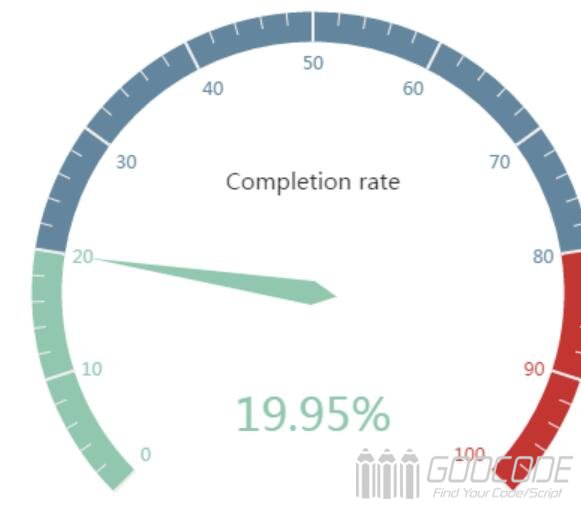
First introduce Echarts, and then place the place where you need to add div # myChart, while adding it to the width and height properties.
<script src="echarts.min.js"></script>
<div id="myChart" style="width: 600px;height:400px;"></div>
javascript
Next, you initialize the echarts instance, set the options, and render the image.
// Initializes the echarts instance based on the prepared dom
var myChart = echarts.init(document.getElementById('myChart'));

option = {
    tooltip : {
        formatter: "{a} <br/>{b} : {c}%"
    },
    series : [
        {
            name:'Business indicators',
            type:'gauge',
            detail : {formatter:'{value}%'}, //The dashboard displays the data
			axisLine: { //Dashboard axis style
				lineStyle: {
					width: 20
				}
			},
			splitLine: { //Split Line Style
				length: 20
			},
            data:[{value: 50, name: 'Completion rate'}]
        }
    ]
};
Tooltip in the option settings is a prompt box component, the default parameter show: true is displayed prompt box. The parameter formatter is the format of the floating-layer content of the prompt box. It supports both the string template and the callback function. Generally, we use the string template, the template variables are {a}, {b}, {c}, {d}, {e}, respectively, said series name, data name, data values. When the trigger is 'axis', there will be more than one series of data, this time through the {a0}, {a1}, {a2} that followed by indexing the way that series index. {A}, {b}, {c}, {d} under different chart types have different meanings. The three types of chart parameters for the pie chart, dashboard, funnel chart are: {a} (series name), {b} (data item name), {c} (numeric), {d} (percentage).
The series in the options is a list of families. Each series determines its own chart type by type, which contains a number of parameters. The parameter name indicates the name of the series, the display of the tooltip, the legend filtering of the legend, and the specifying of the corresponding series when the setOption updates data and configuration items. Parameter type refers to the chart type, type: 'gauge' that dashboard. The parameter detail refers to the dashboard detail, which is used to display the data. You can define the width and height of the data display, the background color, the border color, and so on. The details of the dashboard defined in this example are displayed as a percentage. The axisLine parameter defines the configuration of the dashboard axis, such as the axis style. SplitLine parameter used to define the dashboard in the separation line style, such as line length, line color, line width, and so on. Parameters data is used to display the data, you can set the dashboard indicator corresponding to the value and name.
If it is a dynamically changing dashboard, you can use the setInterval () timer to transform the meter values, such as the following code.
clearInterval(timeTicket);
var timeTicket = setInterval(function () {
    option.series[0].data[0].value = (Math.random() * 100).toFixed(2) - 0;
    myChart.setOption(option, true);
},2000);

