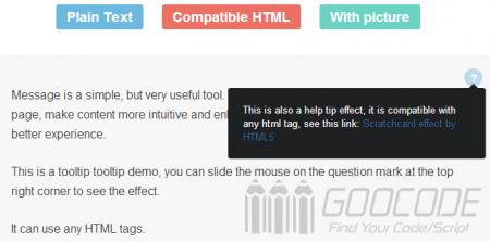
In fact, this article is to share our information tools common to the prompt tooltip, it can provide a very nice message for our page, make content more intuitive and enhance the user experience. We can be found at many online articles about the tooltip, javascript majority is provided based on the plug-in, but in this article we want to say is a CSS code only, without any plug-ins will be able to achieve beautiful, simple, and use information tips Tooltip .
HTML
The first step we are ready to prompt the tool tip contents html structure:
<div class="help-tip">
	<p>This is a pure CSS production, based on the effect of the message CSS3 implementation.</p>
	</div>
The contents of the message in code [p] display as a block, and .help-tip will include the effect of a small circle with a question mark.
The content in code [p] is not displayed by default when the mouse slid question mark, via CSS to display the message, which can contain text, images, links and other html code. Specifically you can see the demo DEMO.
CSS
All are written in a style.css CSS file, you can download the file to view the package, described below under the main core of the CSS code:
.help-tip{
	position: absolute;
	top: 18px;
	right: 18px;
	text-align: center;
	background-color: #BCDBEA;
	border-radius: 50%;
	width: 24px;
	height: 24px;
	font-size: 14px;
	line-height: 26px;
	cursor: default;
}

.help-tip:before{
	content:'?';
	font-weight: bold;
	color:#fff;
}

.help-tip:hover p{
	display:block;
	transform-origin: 100% 0%;

	-webkit-animation: fadeIn 0.3s ease-in-out;
	animation: fadeIn 0.3s ease-in-out;

}

.help-tip p{
	display: none;
	text-align: left;
	background-color: #1E2021;
	padding: 20px;
	width: 300px;
	position: absolute;
	border-radius: 3px;
	box-shadow: 1px 1px 1px rgba(0, 0, 0, 0.2);
	right: -4px;
	color: #FFF;
	font-size: 13px;
	line-height: 1.4;
}

.help-tip p:before{
	position: absolute;
	content: '';
	width:0;
	height: 0;
	border:6px solid transparent;
	border-bottom-color:#1E2021;
	right:10px;
	top:-12px;
}

.help-tip p:after{
	width:100%;
	height:40px;
	content:'';
	position: absolute;
	top:-40px;
	left:0;
}

@-webkit-keyframes fadeIn {
	0% {
		opacity:0;
		transform: scale(0.6);
	}

	100% {
		opacity:100%;
		transform: scale(1);
	}
}

@keyframes fadeIn {
	0% { opacity:0; }
	100% { opacity:100%; }
}
CSS3 code uses a lot of features, use the: before pseudo-class to create a question mark, using the border-radius: 50% to create a question mark behind the circle, eliminating the trouble of making pictures, code or use a css3 animation, transparency changes and so on.
Notably, .help-tip's position is set to absolute, for its parent element .demo the position property to relative. So as to ensure the positioning elements.

