HTML
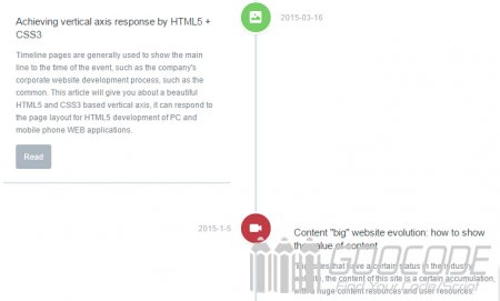
We use the HTML5 tag , Timeline all content including the title, introduction, time and image are placed .cd-timeline-block of DIV, multiple DIV form a sequence, and these DIV in in. Note To see a demonstration of the effect in this case, you need a browser that supports HTML5 and CSS3.
<section id="cd-timeline" class="cd-container">
    <div class="cd-timeline-block">
        <div class="cd-timeline-img cd-picture">
            <img src="img/cd-icon-picture.svg" alt="Picture">
        </div>

		<div class="cd-timeline-content">
			<h2>Achieving vertical axis response by HTML5 + CSS3</h2>
			<p>Timeline pages are generally used to show the main line to the time of the event, such as the company's corporate website development process, such as the common. This article will give you about a beautiful HTML5 and CSS3 based vertical axis, it can respond to the page layout for HTML5 development of PC and mobile phone WEB applications.</p>
			<a href="http://www.goocode.net/css/142-use-html5-css3-to-achieve-vertical-axis-response.html" class="cd-read-more" target="_blank">Read</a>
			<span class="cd-date">2015-03-16</span>
		</div>
    </div>
    <div class="cd-timeline-block">
        ...
    </div>

</div>
This example uses the svg image as an icon, you can also replace the png, gif format images.
CSS
We use the: before pseudo-class to create a vertical line in front of the Timeline # cd-timeline, then the contents of each node in the timeline will be based on these vertical lines.
#cd-timeline {
  position: relative;
  padding: 2em 0;
  margin-top: 2em;
  margin-bottom: 2em;
}
#cd-timeline::before {
  content: '';
  position: absolute;
  top: 0;
  left: 18px;
  height: 100%;
  width: 4px;
  background: #d7e4ed;
}
Well, then we have to do, according to the size of the user's browser window to adjust the layout of the timeline, when the browser window is very large, each node content will be distributed on both sides of the timeline of the vertical line (vertical line center) when the browser window is small enough such as mobile phones, iPad in vertical screen browsing, each node content will be aligned to the right of the timeline vertical line (vertical line to the left), commonly known as the responsive layout.
.cd-timeline-block {
  position: relative;
  margin: 2em 0;
}
.cd-timeline-block:after {
  content: "";
  display: table;
  clear: both;
}
.cd-timeline-block:first-child {
  margin-top: 0;
}
.cd-timeline-block:last-child {
  margin-bottom: 0;
}
@media only screen and (min-width: 1170px) {
  .cd-timeline-block:nth-child(even) .cd-timeline-content {
    float: right;
  }
  .cd-timeline-block:nth-child(even) .cd-timeline-content::before {
    top: 24px;
    left: auto;
    right: 100%;
    border-color: transparent;
    border-right-color: white;
  }
  .cd-timeline-block:nth-child(even) .cd-timeline-content .cd-read-more {
    float: right;
  }
  .cd-timeline-block:nth-child(even) .cd-timeline-content .cd-date {
    left: auto;
    right: 122%;
    text-align: right;
  }
}
CSS3 media screen size can be used to determine the device, perform different css styles depending on the size. This example also uses CSS3 shadows, rounded and other effects, the paper will not elaborate, we can refer to many online tutorials on the basis of CSS3, you can also directly download the source package, in this case the css all finishing in style.css file. Of course, you can also use JS and CSS3 on the basis of this case to increase the number of transition animation to the timeline, the effect might be better.

