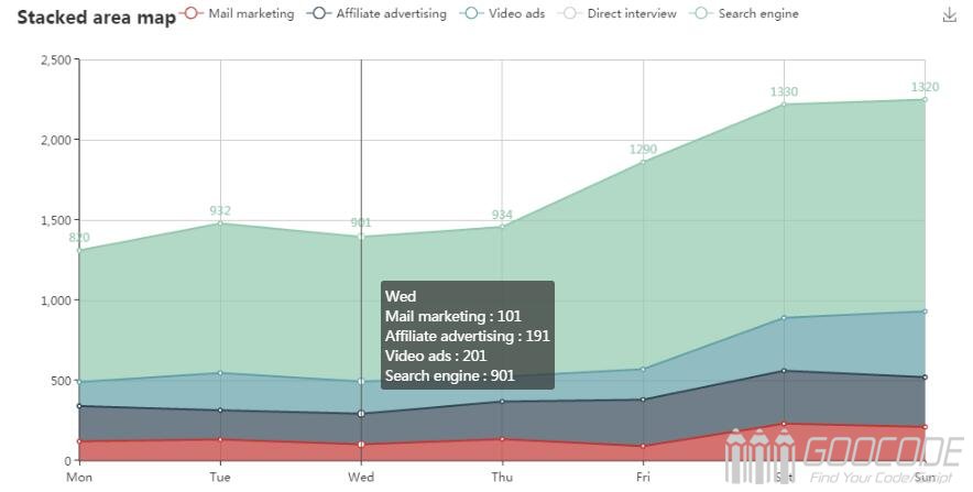
ECharts provides general line charts, histograms, scatter charts, pie charts, K charts, box charts for statistics, maps for geodata visualization, thermograms, line graphs, relational data visualization Treemap, parallel coordinates for multidimensional data visualization, funnel diagrams for BI, dashboards, and mashups between graphs and graphs.
Introduction of ECharts
The introduction is very simple, just like ordinary javascript library with the introduction of the same script tags.
<script src="echarts.min.js"></script> Draw a chart
In the body where the need to place a chart Prepare a highly div container, be sure to set a height.
<div id="myChart" style="width: 600px;height:400px;"></div> You can then initialize an echarts instance with the echarts.init method and generate a simple histogram using the setOption method.
// Initializes the echarts instance based on the prepared dom
var myChart = echarts.init(document.getElementById('myChart'));

// Specifies the configuration items and data for the chart
var option = {
	title: {
		text: 'Monthly sales statistics',
		left: 'center'
	},
	tooltip: {},
	xAxis: {
		data: ["Shirt", "sweater", "chiffon shirt", "pants", "high heels", "socks"]
	},
	yAxis: {},
	series: [{
		name: 'Sales',
		type: 'bar',
		data: [115, 220, 136, 100, 100, 60]
	}]
};

// Use the configuration item and data you just specified to display the chart.
myChart.setOption(option);
After running the code, you can generate a histogram on the page. Next goocode will have more articles to illustrate the use of Echart chart with examples

